American funds
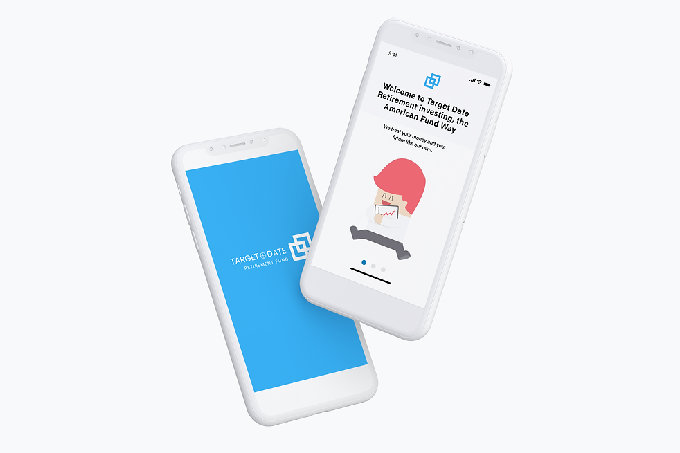
TARGET DATE RETIREMENT FUND MOBILE APP DESIGN
This project was done as a design test that was part of the vetting and hiring process of the UX Design company I currently assist with UX research and design projects.
Project Summary

ABC Capital's American Funds Target Date Retirement Series is a savings plan designed to build and preserve wealth.
The savings plan is based on the model of a "glide path within a glide path," built to accumulate consistent small gains, which have outsized financial outcomes over time.
While the savings plan is within a model of progressive to conservative investments over time, fund managers are constantly watching market fluctuations in order to accumulate these small, measurable gains called "bps."
My Role
Research, Sketching, Usability Testing, High-Fidelity Design
Platform
Sketch, Photoshop, InVision
Goal
Create a mobile app interaction design that enables clients to visualize dramatic outcomes, which can result from slight changes in bps, as represented in the below, which was also handed to me along with the ask.
Vital information should be conveyed immediately and attractively, and the design should be easy to use
Make accessible, in full, all of the data contained in the graphic, including assumptions and scenarios.
Timeline
1 week of research, testing, and design
Discovery
Step 1:
Market Research
Step 2:
Persona Creation
Step 3:
Design Studio:
Main Page
Step 4:
Usability Testing
& Insights
Market Research
The immediate problem was comprehending every single part of the complicated Source Data graph below.
This took me longer than I thought it would. I did market research in general, then more specific. I asked economics savvy people what the graph meant, only to get back varying answers.

I revisited the graph over and over again, until it finally clicked.
Good Practices and Conventions
Alongside market research, I completed a competitive and comparative analysis to find the conventions of a savings plan mobile app, as well as some good practices.

Conventions = Carousel dots and swipe-up bar.
Good practices to follow: Complicated concepts such as ours simplified and explained through a series of frames instead of one single image, and Disclaimers being placed at the bottom of the screen.
Persona Creation
I created two personas: the Savvy and the Free-Spirit


The content of our graph, if explained well, would convince Greg in and of itself. However, we need to implement a lot of design theory to convince Alyssa to try.
Design Studio (Main Page)
I at first sketched the pages which I envisioned would be interacting heavily with the user by changing in realtime as the user inputted their information.
This is where having spent too much time with the original graph was hindering me. I felt I had to make a better graph; I wasn’t thinking outside of the box.
I thought maybe percentages instead of bps, or dollars instead of “gains," would help.

Usability Testing
Usability testing with these frames, however, was insightful.

QUANTITATIVE INSIGHTS:
-
Understanding of bps 0/2
-
Intuitive Swiping 2/2
-
Expectation for Interaction 1/2
INSIGHTS:
-
Reworked graph and percentages are not the
best way to understand bps
-
Carousel dots are intuitive for users
-
Clear CTA after data input
QUALITATIVE INSIGHTS:

-
Need a more attractive way to convey post-retirement
-
Find a better way to convey percentages so that they are understandable


-
Illustrations and icons speak more to user than the graph and percentages
Revisiting the Problem
-
The average person does not understand the concept of the radical end gains that result with tiny changes in bps throughout the lifetime of an active Target Date retirement fund such as that of American Fund.
-
Moreover, the average person’s mind deviates from graphs and percentages, not fully understanding information that is incredibly relevant to them.
-
How can we explain visually the concept that the accumulation of tiny increases in bps over time is life-changing for the user?
How do we design in order to allow the user to interact with the application in a way that enables envisioning the money they personally could have if they were to invest in American Funds Target Date Retirement Series.


Design Process
Step 1:
Workshop
Part 2
Step 2:
Usability Testing & Changes Made
Step 3:
Mid-Fidelity
Sketches
Step 4:
Hi-Fidelity
Prototype
Workshop Part 2
Looking back to the good practices in my C&C, I sketched the following wireframes keeping in mind that little chunks of information and visuals are necessary to effectively convey data and concepts

Wireframe 1
Wireframe 2
Wireframe 3

Wireframe 4
Wireframe 5
Wireframe 6
Usability Testing & Changes Made
Changes were made to the following screens based off of user feedback.

2/2 users said imagery here was confusing
CHANGES IN MID-FIDELITY
Use more literal symbols/expanding concept and using more wireframes

-
1/2 users conveyed unease about age and use of sliding scale for “Retirement Age” field
-
1/2 users said the information in the input fields seem random
-
1/2 users were unsure what would display after pressing CTA “Calculate” button
CHANGES IN MID-FIDELITY
-
Retirement Age changed to Input Field
-
Input Field information arranged by relevance
-
Extra wireframe created in order to explain user’s possible earnings

1/2 users did not like term “buying and selling”
CHANGES IN MID-FIDELITY
Change word to “investing”

1/2 users did not like term “monitoring”
CHANGES IN MID-FIDELITY
Change to “keeping a close eye on”
Mid-Fidelity Sketches

Wireframe 1
Wireframe 2
Wireframe 3

Wireframe 4
Wireframe 5
Wireframe 6

Wireframe 7
Wireframe 8
Hi-Fidelity Prototype
Wireframe 9