Project Summary
The client Artist & Craftsman Supply is a 100% Employee-owned Company, with a diverse customer base ranging from the serious artist to the hobbyist, and just about anyone looking to have fun with art supplies.
Through their 34 brick and mortar locations as well as their online store, Artist & Craftsman Supply is one of the largest art material suppliers in the United States.
My Role
Heuristics Evaluation, Comparative & Competitive Analysis, User Research, User Interviews, Screener Surveying, Persona Creation, Task Analysis, Journey Map, Site-Mapping, Card Sorting, User Flow, Wireframing, User Testing, High-Fidelity Prototyping
Platform
Sketch, Photoshop, Keynote
Goal
Site redesign to enhance usability through improving site architecture and simplifying checkout process in order to increase conversion rates.
Timeline
1 week of research, 1 week of design ideation, testing, and prototyping



Overwhelming Site Navigation
-
Certain items appear to be clickable, but are not
-
Too much depth; Average of 4 clicks to reach product listing
-
"For Kids" items unable to be accessed through navigation modes
Navigation Bar
-
11 items in navigation bar
-
Direct competitor sites average 7 navigation bar items
Hero Image
-
Hero image is a large, colorful coupon spanning the entire home page
-
Confusing users as to where they should direct their gaze
-
Design is cluttered and haphazard
Suggestion to Register
-
User's eye guided to red asterisks prompting registration
-
Users assumed this meant mandatory registration prior to checkout and annoyed at the immediate suggestion
Checkout Process
-
It takes 7 tedious steps, filling out forms to purchase and checkout
-
Both direct and indirect competitor sites show a checkout average of 3 steps
Current Website
Discovery
Step 1:
Evaluate Current Website
Step 2:
Online Screener
Surveys
Step 3:
User Interviews
Step 4:
Persona Creation
User Research
Survey Results
Survey Results revealed that people who prefer to shop for art supplies online than in store do so in order to save time
and to access products that are available online, and not always available in store

User Interviews
I asked interviewees open-ended questions about previous experiences buying art supplies. I then asked them to complete the task of buying Crayola Crayons from the current website while thinking out loud.
Through affinity mapping, I detected trends in user pain points which I synthesized using user quotes.
"Do they seriously not carry Crayola Crayons?"

Items in the navigation bar sorted poorly; users are unable to find basic product
"I actually like it when each product I click on opens up a new tab"

"I wish all the checkout
info was on one screen"
Digging deeper as to why... ?
-
Users do not wish to go back to a previous page to compare products
-
Users wish to feel like they are moving forward throughout entire shopping experience
-
Users wish to see image, price, and details of product they are purchasing throughout entire checkout process
Remember that one art store in Santa Cruz?"

"I used to spend so much money there because it was so posh and sleek. I wanted everything in there."
-
It is not color or paintings on the walls of an art supply store that will inspire users to buy art supplies; It is the visual of art supplies in of themselves that inspires users.
-
Design should direct user's gaze to the art supplies
"Ugh, is it seriously asking
me to create an account
right now? No thank you."
"You've gotta be kidding
me; a gazillion steps to
checkout."
"At this point, I'd just go to Amazon and buy a box of Crayola Crayons."

"Ugh, you've gotta be kidding me; a gazillion steps to checkout."
-
Users are turned off by the immediate suggestion to create account on first page of checkout.
-
Users drop out of the website when they see how long checkout process is.
The checkout process is a huge pain point:
Research Synthesis
Persona Creation

I created a persona in order to synthesize and communicate the collected data on user motivations and frustrations.
Ellen Howes
29, After School Art Teacher

Ellen is an After School art teacher who oversees the daily art space at work.
She loves her job but it is exhausting; she strives to not to spend much time outside of school planning and preparing activities for her students.
GOALS
FRUSTRATIONS
-
To spend less time on work related projects on her free time
-
To regularly purchase art supplies quickly and efficiently via websites
-
To be able to quickly find all that she needs

-
Spending too much time finding and obtaining the materials she needs
-
How long checkout often takes

Ellen's Journey
Objectives
The website is failing users both in terms of time and access to available products.
After the grueling process of finally finding products, users quickly leave the website during the 7-step checkout.
-
Reorganize navigation bar
-
Redesign homepage layout
-
Create stronger sort features
-
Include related items listing in product detail page
-
Include image and product on every checkout page
-
Condense checkout forms to 3 pages
Problem
CONCLUSIONS
Design
Step 1:
Site Architecture
Step 2:
Sketching Wireframes
Step 3:
Usability Testing
Step 4:
High-Fidelity
Prototype
Site Architecture
Card Sorting

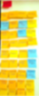
After four open card sorts, the trend was that people would sort the high-quantity and more popular items together into about six categories, and would put everything else under a category labelled “Miscellaneous”
New Site Map

-
Each secondary navigation item goes directly to a product listing page, where the user is able to sort by type, brand, price range, and customer reviews
-
For Kids section removed from navigation bar items to improve navigation to certain products
-
Fewer clicks are required for users to find desired product.
-
Reduced items in Navigation Bar from 11 down to 7
Lo-fidelity Wireframes

Since the design process was only a week long, I began rapidly ideating different versions of each page that would be making up the high-fidelity prototype in order to test usability and flow.
Usability Testing
Homepage

1. Logo/back to HOME icon
2. Search Bar
3. Account: Log In, Wishlist, Create Account
4. Store Finder
5. Checkout/Shopping Cart Icon
6. Navigation Bar
7. Coupon banner
8. Hero Image
9. Coupon with transparent background
10. More information about deals
11. Social media links
Shopping Process


Checkout Process and Forms

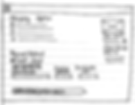
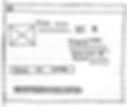
USABILITY TESTING FINDINGS
-
Homepage should not have transparent coupon over hero image; distracting to user
-
Homepage should include Featured Items and Sale Items
-
Strong sorting features are necessary; gives user agency to sort themselves
-
Featured products should be in product detail page below image and description
-
Option to Proceed to Checkout should be replaced with Add to Cart CTA on product detail page
• Progress tracker should be designed differently; Three bars appears to users as antiquated
-
It is necessary to have a Confirmation/Thank You page as the final wireframe
High-Fidelity Prototype
Next Steps
-
TEST high-fidelity prototype
-
Monitor metrics from business to ensure that the redesigned website is increasing conversion rates
